My Top Five Favourite Title Fonts on Book Covers!

Good morning, afternoon and evening bookworms! It’s Wednesday and that can only mean that it is time for another Top Five Wednesday post! This is a weekly bookish meme created and hosted by gingerreadslainey on Booktube and Goodreads where we choose a topic and pick our top five related to that certain topic! Anyone is welcome to join.Β
This week’s topic is our top five favourite fonts on book covers! I am a huge lover of fonts. It’s no secret that I love to download new fonts whenever I see them, and I constantly follow Bella @ Ciao Bella’sΒ Font FreebiesΒ posts! When I see book covers with gorgeous fonts for their titles, my heart melts. So, let me show you my top five picks…
1. Eragon by Christopher Paolini
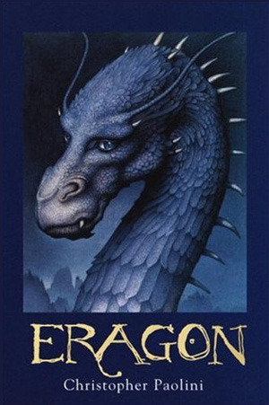
Nothing pulls me in quite like an old-style font that matches with the genre and premise of the book. Not only is the font forΒ EragonΒ absolutely beautiful and old-style, it fits in perfectly with the entire cover! It’s a perfect compliment to the dragon and the texture of the book and I can’t help but love the perfection of it!Β
It was one of the things that persuaded me to purchase and read this book, and thank God I did because my goodness, Christopher Paolini has become one of my biggest role models, right up there with J.R.R Tolkien, Patrick Ness and Sarah J Maas!
2. Fangirl by Rainbow Rowell
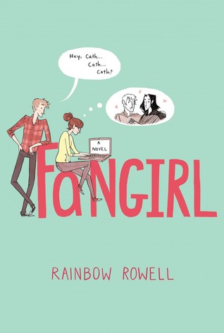
Now please don’t tell me that the font doesn’t catch your eye.Β OF COURSE IT DOES, LOOK AT IT!Β It’s so simplistic and exerts the perfect atmosphere that indicates exactly what kind of book this is going to be.
The font is that hand-drawn type of font that I constantly look for when looking at font freebies.Β Honestly, I think I have an obsession with hand-drawn fonts. Send help.Β And look at that beautiful colour!Β It makes me want to weep at the perfect contrast between coral and turquoise.Β
3. Magonia by Maria Dahvana Headley

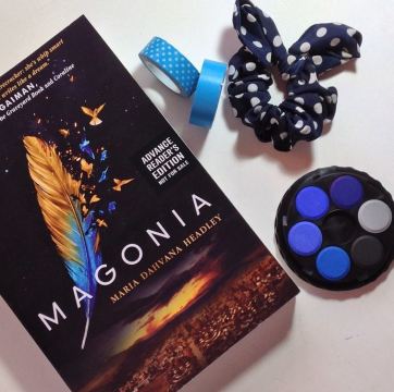
Beautiful cover aside, I adore the simplicity of the title font. The spacing is perfect and the silver colour combined with it allows it to have a dominant place in the cover. It strands out beautifully!Β
4. The Knife of Never Letting Go by Patrick Ness
The title font for Patrick Ness’sΒ The Knife of Never Letting GoΒ is so gritty and aggressive, like it’s literally throwing a bucket water in your face.Β And I love it.Β It’s like someone finger-painted it or painted it with a brush. And not only that, but it corresponds to the story within also!Β Bonus!Β
5. Shatter Me by Tahereh Mafi
The title font inΒ Shatter MeΒ is bold, dominant and its got a lovely effect that fills it’s empty bold space that looks like smoke or splatters of some kind. It’s fabulous and honestly seriously catches my eye every time! The fonts only get better as the trilogyΒ progresses.Β
51 responses to “Favourite Title Fonts on Covers | Top Five Wednesday”
Nice picks Josie!
I really like simple fonts like Magonia or minimalistic hand drawn fonts like Fangirl because they’re easy to read and don’t clutter the cover page. The Knife of Never Letting Go isn’t one I’d usually like, but it seems like it matches the book’s atmosphere (never read it though so I’m not sure). With Throne of Glass, that’s an iffy. I’m not a fan of different fonts on the same title. Like, stick with one guys! π
LikeLiked by 1 person
Yes fonts like Magonia and Fangirl are so wonderfully simplistic!
TKONLG font is very harsh and chaotic but. It definitely matches perfectly with the book and the story! (it’s an amazing book by the way, which I suggest you read!)
Indeed, different fonts together is a little meh. But I like it!
Thank you Aila! xoxo β€
LikeLiked by 1 person
I agree with all of these! π Sadly I haven’t read all of these books yet, but one day I will!
LikeLiked by 1 person
Yaaas! And no way! π± Get onto reading them soon girl! β€
LikeLiked by 1 person
I will!! The Knife of Never Letting Go is on my shelf so I will get to it soon!
LikeLiked by 1 person
These are all such fantastic titles that really draw you in – I am a big fan of those simple ones like Fangirl and Magonia! THe fantasy ones definitely show you what the book is going to be like too!
LikeLiked by 1 person
They really are! I think simplistic is one of my favourite approaches to book covers and fonts, and yes I love when fantasy covers use the elements of title and images to give a feel of how the actual story will be like! That’s how I felt with Eragon.
Thank you for the lovely comment Jeann. xoxo π
LikeLike
This post just woke me up with all of its gorgeousness! The Tahereh Mafi covers are absolutely striking, aren’t they?
LikeLiked by 1 person
Haha! I’m glad it was invigorating! Pretty covers never fail to spark my brain!
Oh they really are! I could stare at them forever!
xoxo
LikeLike
Ohhh I LOVE beautiful titles! π I really love the ones on the Splintered by AG Howard trilogy….sooo beautiful. XD SHATTER ME TOO, THOUGH. Everything about the Shatter Me cover is beautiful.
Thanks for stopping by @ Paper Fury!
LikeLike
Yes, I’ve seen a couple people mention the Splintered cover! The font is really lovely!
Indeed, the Shatter Me cover in general is freaking gorgeous! And the Ignite Me cover?! *weeps with happiness*
Thank you for stopping by too, Cait! xoxo
LikeLike
Eeep I love this topic! Me + Fonts = Love. Lol. Anyway, I totally agree with your picks of Eragon (I love those scratchy-looking fonts in general), Fangirl (I mean duh, it’s both cute and professional and the perfect shade of hot pink), Magonia (I love simple fonts with letters that are spaced apart) and Shatter Me. I’m a bit on the “meh” zone for Throne of Glass–I like the serif part, but not the cursive part. And I’m not a fan of how some letters for The Knife of Never Letting go are fat and others are thin. xD Angellfall… it’s a font that would work for some things and not for others.
Lovely post, girl! π
LikeLiked by 1 person
Yaaas! Fonts are life!
I think the Eragon, Fangirl and Magonia are my favourites in this entire list and you’re spot on with my thoughts on them too!
Yeah… I think the Throne of Glass fonts are kinda generic to be honest, but I like the look of them with the series overall. I can’t imagine any other font being used!
I definitely think the Angelfall fonts are very limited to certain books. But I think it went well with the series!
Thank you Aimee, love! π :*
LikeLiked by 1 person
These are all wonderful choices! I particularly love the font used for Fangirl. Fonts that have that hand-drawn look are so beautiful, and the style fits the content of the novel perfectly! I also love the simplicity of Magonia. There is something so eye-catching about clean and simple typography. Great post! π
LikeLiked by 1 person
Thank you! And yes I agree, hand-drawn fonts are just so lovely! And you’re spot on with Magonia!
Thank you for stopping by! π
LikeLiked by 1 person
great choices!!!! My favorite cover would probably be Shatter Me. I absolutly love the eye on the cover. Thank you for this post=)
LikeLiked by 1 person
The eye is definitely gorgeous! I love the transition of the eye as the series goes on too! It’s amazing. Ignite Me is the most beautiful cover of them all!
You’re welcome and thank you for the lovely comment πβ€β€β€
LikeLiked by 1 person
Who says the Fangirl font doesn’t catch their eye?! I feel like Fangirl’s cover is one of the most well done covers out there. it’s so simple, but striking and it completely captures the essence of the book! Lovely post, as always, Josie! x
LikeLiked by 1 person
I think so too! With everything from the colour to the font to the simplistic use of white space in most of the cover, I think it really just tells a thousand words in itself!
Thank you Aimal! β€β€β€
LikeLiked by 1 person
How great is the SHATTER ME font!? I love it so much — especially as I kinda think it suits Juliette growing bolder, and bolder throughout the novel. And I’m SO in love with ToG’s US cover font. ππ
LikeLiked by 1 person
IT IS SO GREAT! π Yes you’re so right!
Who wouldn’t love the Throne of Glass font? π
LikeLike
I love the Fangirl cover so much, I think because of the pastel colors! β€
LikeLike
Definitely! The pastel colours are so beautiful together! π
LikeLike
Awesome Choices! The cover of The Knife of Never Letting Go, Fangirl and Shatter Me looks stunning. π
LikeLiked by 1 person
Thank you! Glad you think so! β€
LikeLiked by 1 person
Such great choices on this post, Josie! I love all the fonts you picked out, and you’re right, I didn’t think that about Magonia’s title on the book cover, but now I definitely see it standing out so beautifully π I especially love the Patrick Ness’ one. It’s raw, it seems painted, and I just love it! π
LikeLiked by 1 person
Thank you! Oh I’m glad you see it that way now! And yes TKONLG title font is simply fantastic π
LikeLiked by 1 person
I love that you didn’t pick the typical scripty fonts. Good choices!! π
LikeLiked by 1 person
Thank you! I wanted to pick a very good variety because there really are so many books out there!
LikeLike
The font on Fangirl is just my absolute favourite! I love the Angelfall one, too! And ooh, The Knife of Never Letting Go! That font is gorgeous! β€
LikeLiked by 1 person
Yay! They are such pretty fonts it’s hard not to love them!
LikeLiked by 1 person
Totally! The Lunar Chronicles font is also very beautiful, don’t you think? π
LikeLiked by 1 person
That cover of The Knife of Never Letting Go is just BADASS and EYE-CATCHING π
LikeLiked by 1 person
YES! π
LikeLike
Lovely choices! Totally agree with the things you said, though I might have a difference of opinion on that Eragon one haha
LikeLiked by 1 person
Thank you! Glad we have some in common! And what do you think about the Eragon one? It doesn’t really appeal to you? π
LikeLiked by 1 person
Not really, looks really childish to me haha
LikeLiked by 1 person
Everything about Fangirl is just the best. The Shatter Me cover kind of scares me. Sometimes I have to turn creepy covers away from me to go to sleep. There’s this book called John Dies @ The End which has a severed arm on the cover. I had to hide that one from myself after I finished reading every night so I could sleep. #wimp.
I think the cover for The Rest of Us Just Live Here, Patrick Ness’ latest, is awesome.
LikeLiked by 1 person
Yes I agree. Fangirl is amazing in every aspect!
Really?! You think the Shatter Me cover is freaky?! I find it totally beautiful! π
Oh lord… That cover sounds graphic. I wouldn’t want that anywhere near me! Especially at night!
I adore The Rest of Us Just Live Here cover! It makes me want to weep with happiness.. β€
LikeLike
I think I just have kind of a thing about eyes…
LikeLiked by 1 person
Great list! I completely forgot about the awesome font for The Knife of Never Letting Go and Angelfall! And YAS Fangirl!!
LikeLiked by 1 person
Thank you! There’s always that one or two books that we forget about! Fangirl, yaaaaas!
LikeLiked by 1 person
I don’t know why, but I always get attracted by the cover of The Knife of Never Letting Go..
LikeLiked by 1 person
Because it’s AMAZING! π
LikeLiked by 1 person
I love Fangirl and Shatter Me too! I also like the font of Armada, it kind of has that old-school arcade look.
LikeLiked by 1 person
Armada is also lovely! I would have put that in although I only picked books that I’ve read! π
LikeLiked by 1 person
Awesome choices! I definitely agree on all of these, especially Fangirl, The Knife of Never Letting Go and Shatter Me. π And Magonia, too! They’re all just so beautiful. β€
LikeLiked by 1 person
Thank you, Analee! Glad you agree! π They seriously are all so lovely.
β€
LikeLiked by 1 person
I love Fangirl’s font. In truth, I love everything about that book… π great choices
LikeLiked by 1 person
Damn right, the entire book is fantastic indeed! Thank you Cristina π
LikeLiked by 1 person
π
LikeLiked by 1 person